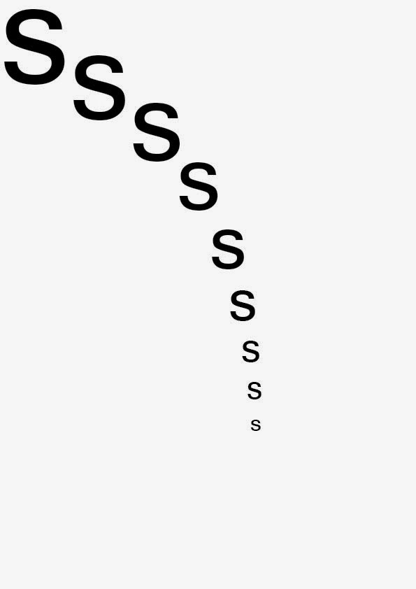
Project 2: This aim of this brief was to tell a narrative through the theme of memory.

Initially I began researching semiotics to tell a narrative. I was more interested in how advertisers use semiotics to manipulate the viewer’s opinion of a product. Semiotics is closely related to symbolism for example: the Mcdonald’s logo could be perceived as golden arches which beckons good people to enter. This then lead me to look further into logos so I could understand how and why they are made.

After researching books, films and adverts based on logos, I began to understand the influence a logo has on consumers. Logos have the ability to add imaginary value to a product, for example designer products are usually only bought because of the company name; the product itself may be high quality but the company may exploit customer’s money because their belief of the product is unnecessarily high. Thus, logos have the ability to create profit because it is the company’s identity. If the logo is memorable then consumers are more likely to refer to it and trust it. Therefore I found it interesting how consumers associate the value of the logo to the product.


Above: Playing around with the identities of various logos.

I decided to look in my room and document as many logos I could see. It didn’t take me long to realise that every product in the room had a logo; no matter how small the product was, they all had an identity associated with it. Hence, I decided to take existing logos and manipulate them on Photoshop so that their identities were mixed. I showed my classmates the results and they were still able to recognise the different logos even though they were mixed up.

Next, I researched on the basics of a successful logo, overall the main three factors were simplicity, relevance to the product and font/imagery, Hence I thought I would create my own logos because logos themselves are a narrative. However logos are created to give identity to a product or service; my problem was that I didn’t have a product of my own to relate to. I decided then to create logos on products that don’t exist such as emotions. As a next step, I began to look at different emotions and designed the logos however, the response I received was that the logos were too literal and in my opinion they were not distinctive enough.

I then tried to portray emotions through using one letter and typeface; in this case I used the letter S to represent myself and the typeface Sans Serif. I played around with the letter making sure that I used the space of an A4 sheet each time. This was more successful in capturing the viewer’s attention compared to my initial logos because it gave the view more to think about. 20 emotions were created in the end but I also wanted to bring the project a little bit further; thus I decided to present the emotions in a book.

In this book, I decided to refer to polaroids I have taken throughout the month of October. The polaroids have also been an influence after watching the film Memento, where the main character takes polaroids in order to remember events. Each chapter is a specific date which I have captured on my polaroid. The emotions were selected from the 20 and will show how I felt on the day, thus I am portraying a typographic journal in a narrative book.


content
disappointed

excited


confused


lost

sad


After receiving feedback on my first draft, I decided to make a 2nd edition for November. I made an extra three emotions and also included cover pages to give my book more context. The cover pages are photocopies of my polaroids so it should make it clearer to the reader of what my book is about.
Overall, I enjoyed my final piece and I feel that the ideas have come together in the end. If I were improve anything it would be to experiment with different printing techniques to improve the aesthetics and content of the book.


Project 3: The aim of this brief was to create a positive campaign for a type of discrimination.

I decided to highlight the problem of discrimination against body art.  Discrimination is the practice of unfairly treating a person or group of people differently from other people or groups of people.

I gained inspiration from reading articles about people who were rejected or treated differently because they had body art. The reasons for the discrimination is that it doesn’t comply with the presentation of the company, it wasn’t professional and it defaces the body. However, they were only discriminated if the tattoos were large and visible. Some people with small tattoos may not have the same problem because other people cannot see it.

Shirin Neshat is an artist who uses photography to show social, cultural and religious norms in Muslim societies. In her work for Rebellious Silence, she writes conflicting messages on her face to address her views towards the Muslim society. I enjoy the way she presents her work as it is very straight forward and thought provoking, thus I decided to similarly have my work to be visually empowering.


After attending various printing workshops (such as collagraphing, dry point etching, screen printing. lino printing and laserink jet) I found similarities between printing on skin to printing on paper.  I was going to make a film showing the comparison between skin and paper showing how having a tattoo is not always a bad choice. However, there wasn’t a clear message I was trying to portray and it was not prominent enough to evoke questioning and emotions therefore I decided to move on from this idea.


The message I wanted to show to my audience is that “being professional should be how you act and not what you wear”, this lead to the idea of printing onto professional attire instead of printing onto paper. A shirt is socially accepted to be the uniform of a professional however it shouldn’t be forgotten that it doesn’t matter how smart a person looks if their attitude does not reflect a professional manner.

Inspired by Shirin Neshat and Jenny Holzer, I chose different tattoos to draw onto the shirt, whilst choosing a strapline saying, “am I a professional?” Most tattoos are subjective and have a meaning behind them; I think it’s unfair to disregard someone because they have something meaningful inked on to their skin. I think it is the same as having an accessory or clothing because it gives a person a form of identity. 

Overall, I enjoyed the process to my final outcome. I feel that I was able to experiment extensively for this brief because I was able to attend the workshops. I am happy with my final outcome because it has a slight satirical humour to it and also presents a visually strong message. If I were to improve it I would create a “how to be a professional” uniform pack, where I would create a whole set of clothing filled with tattoos.


Above: Hand drawn designs


Project 4: The aim of this brief was to create an advertising campaign with a remake of a Stanley Kubrick film. We had to use 4 out of the 5 facility areas of the university and had to make sure that the 4 outcomes were coherent.

I had not heard of Kubrick prior to this brief. This meant I had to do extensive research about his films and the way that he worked. I was able to discover from the Kubrick archive that he is very meticulous and passionate with the way he works, if not obsessive with detail. His films were not my usual style however I do respect the amount of detail that he went into for his films. In the end I had chosen Eyes Wide Shut to be the film for my campaign because it was the only storyline which caught my attention.

My remake was to modernise the setting to the celebrity world where reality and stardom are mixed into an ambiguous mess. Celebrities are always putting on a farce when facing the public and you never know whether they are being genuine or not. The theme was “hidden” and I began to research into the celebrity world of how they are portrayed and the ways they act. Everything was exaggerated from reality and the media presents them in an unrealistic flawless way.

Thus, I decided to use the colours black and gold to follow on the glamorous theme and I also had chosen a highlight piece (a venetian mask used in the elite cult scene) as my initial interactive piece. As the weeks went by I found myself fully immersed into the process areas of the university and experimented with many new processes such as book binding, embossing and laser cutting. These workshops enabled me to create my final pieces for my campaign.


I knew I wanted to emphasize the hidden theme thus I thought of ways I could use that within my project. First of all I rebranded the logo and used that to connect all of my outcomes. Next I used laser cutting to cut out the logo on the leaflets and book marks to carry on the hidden theme. I also used the laser cutter to cut my venetian masks which I designed to be used as a perk for watching the film. I also combined my skills from the embossing and book binding workshop to create a sketchbook with the logo embossed on the cover. Embossing works well for the hidden theme because the type can only be seen when light is shone onto it. Lastly, I decided to learn to use after effects to create a kinetic typography trailer for the film. It was challenging however I was able to finish it with countless self-teaching from Youtube. Thus with countless trial and error I was able to create successful coherent pieces of work.


The final outcomes were:
1.       Bookmark – (3D and print finishing)
2.       Leaflet – (3D and print finishing and reprographics)
3.       Venetian Mask – (3D)
4.       Sketchbook – (printmaking)
5.       Trailer – (moving image)

Even though the brief asked for 4 outcomes, I found it easy to surpass that number because I believe I handled my time very well for this brief. I also enjoyed it very much because advertising and marketing is a field I am very interested in. Moreover with extra time to spare, I was able to develop ideas of possible packaging for the bookmark and masks. If I had more time, I would have completed the packaging for the bookmark and masks. This project was enjoyable and is my favourite brief so far, I felt that I learnt a lot and was more able to use the university’s facilities compared to a month ago.


Above: Trailer I made using kinetic typography in Adobe After Effects 


Project 5: I had to create my own brief.

My final project will be exhibited at my university. I am inviting all my readers and friends to attend my exhibition on 28th April 6 - 9 pm for Private Viewing. It will be a great evening to see my work in person and to show what LCC foundation has to offer (plus there will be nibbles and drinks). 


What was your project about?
My project is about de-stressing. The interest started when I began to notice how I am easily stressed by social and education means. At Christmas, I was given a colouring mandala kit, it is a Hindu/Buddhist symbol for meditation. Each colour and pattern represented their own meanings and were suited for different types of worries. The designs of the mandalas led me to research why the majority of humans prefer to look at symmetrical objects. The reason being is that our brains are wired to be attracted to symmetrical objects because it’s much simpler for our brains to understand. Initially, I believed I was a visual learner hence I gave the mandala meditation a try but it did not work as well as I intended. Thus, I took a step back and researched further into the causes, symptoms and solutions of stress to figure out which type of stress applies to me. There are two types of stress: acute and chronic. Chronic is long term and requires professional help to solve it. Acute stress is short term, manageable and curable. There are 7 types of acute stresses: mental, emotional, physical, chemical, nutritional, psycho-spiritual and traumatic. After exploring all types of solutions to stress, I narrowed my focus to mental, emotional and psycho spiritual because they were most relatable to me. This led me to testing each solution and figuring out which solutions were most successful. Of course I knew everyone reacts to stress differently therefore I made the project personal and hope that either one of the solutions in the book is able to help the reader.

I wanted to make my piece interactive thus I needed my piece to be in a form where it can be touched. In the end I decided to create a book because it was a great way to contain information and a book itself is interactive. I knew I didn’t want my book to be a factual psychological book, I wanted it to be simple, helpful and fun book that helps to reduce people’s stress.


The final piece.

Did your intended course of action always go as you expected? If not how did you exploit opportunities that arose?
After deciding what stress to research, I explored various ways I could influence my book with the solutions. For example, I looked at colour and discovered blue, green and purple were most harmonising to our minds; hence I could apply those colours to the pages. Originally I was very interested in pop up techniques and playing around with paper because it was an accurate technique which results in a beautiful outcome. I felt that paper itself was quite a soothing material however after researching the solutions to stress it altered my book completely. I felt that adding pop up techniques to the book would have made the book too clumsy and cumbersome to make because I was already fusing embossing, cut outs and acetate to my book. Another unexpected outcome was changing my book into a colouring book, whilst I was listening to music I began to draw patterns and illustrations of how I felt during each song. This in turn, resulted to be the background of most pages in the book, where the reader is able to colour the illustrations.


Research and content. What and who inspired you? Why?
Initially, I was inspired by the golden ratio because it was scientifically proved that most humans enjoy pieces which were made by that technique. This led me to research into Leonardo Da Vinci’s work and made me discover how “The Last Supper” and “Mona Lisa” were all based on the golden ratio. I was very fond of this mathematical technique and made sure that my book dimensions were of that ratio as well. Thus, I learnt how to measure the golden rectangle (using the formula a+b/a) and also decided to make my book hand pocket size to ensure that the book is easy to carry.

Symmetry was also another thing which inspired me, most of my illustrations were made into symmetrical patterns which not only made my book more aesthetically please to look at but also provided a base for my book to keep the pages flow into one to another.
Uplifting quotes were also a main factor to my book, I found these quotes to be one of the most impactful solutions to my stress because when you are stressed your mind tends to wander and overthink. Reading these straight forward punchy quotes tends to set the mind straight because it is easily understood.

Lastly I didn’t want the book to have pages numbers because I wanted it to flow without any interruptions. I believe most of my inspiration came naturally from researching the solutions, it changed the format of the book as I was responding to the solutions. Moreover, I wanted it to be a book where it didn’t matter what page you opened because at least one of the solutions should be able to help the reader.


Experimentation, materials, methods and processes. What worked and what didn’t? Why?
I did experiment with pop ups however they were proved too fiddly and also restricted the number of pages I could have in the book because pop up books usually are quite thick, therefore I did not include the pop up mechanisms.

Majority of the time I was playing around with the design and layout of the pages, I didn’t want the pages to look predictable and synonymous. I tried very hard to make each page relate well to the text on the page. A main influence to the pages were the illustrations I drew, I had to scan them all in before creating patterns out of them for the backgrounds of my book.

In terms of binding my book, I chose coptic binding rather than hard cover because I enjoyed how the reader is able to open the book flat which means it is easier for them to colour it in because it has an open spine. It also required no glue and was simple to sew the pages.  However, I found it difficult to have a tight binding because my folios were very thick, this meant the alignment when cutting the pages were a little off because the pages kept moving. Thus, over Easter I had to rebind the books to make the book look more succinct and neater.

Screen printing was also quite a challenge for me. I had forgotten most of the process because I had only tried it once. It took quite a long time to remember how to prepare my screen however the outcomes were successful and I was able to overcome this challenge. Printing onto book cloth worked very well which I used for my boxes; however I discovered that felt did not absorb the paint well.

I also wanted to foil block my pages because they gave a nice sheen however the paper I chose (fabriano) had a much different texture to the paper I tested with the foil. The foil did not adhere to fabriano smoothly hence I decided to not include the technique in the book.
I wanted to make my cover embossed because I enjoy the beauty of seeing the type when there is no type on the page. I named my book ”Calm” because it was a word which best represented the whole theme. Moreover embossed writing on white paper is quite soothing to look at. Prior to embossing, I had to lasercut my design and that was very simple to do because I have had experience beforehand with my previous Kubrick project. I would say the outcome of the covers worked very well.

Additionally, I wanted to contain my book in something presentable thus I decided to make a box. Box making  was proven a challenge because I was briefly taught in a workshop how to make a clampshelf box however since the workshop area was closed over Easter I had to prepare everything at university an assemble it at home. I felt that if I had access to the facilities over Easter, my boxes could have been of higher quality.


final piece ft. selena's awesome cat jumper


I made three just in case I make a mistake.


What ideas has working on your FMP given you for the future? How would you approach this project differently if you did it again?
If I were to do this project again I would make sure that the pages and boxes were cut cleaner. Due to being rushed on the last week before Easter, the alignment was not as good as I would have liked it to be. I would also create second or third volume of the book which would include other types of solutions to appeal to a greater audience. Completing the FMP has made me understand myself better. I have come to realise why I become so stressed and with thorough research I have learnt how to deal with it well. The project is a success not only with its outcome but also completing the aim of finding my inner peace. I definitely think that the skills I have learnt from this course are transferable to my degree course next year. Lastly, I have thoroughly enjoyed this project and would love to create an improved version of the book in the future.


I fall in love with film every single time. Here's a few snaps from my summer holidays.