Foundation at LCC - Brief 2 - Narrative and Memory

/
0 Comments


Project 2: This aim of this brief was to tell a narrative through the theme of memory.

Initially I began researching semiotics to tell a narrative. I was more interested in how advertisers use semiotics to manipulate the viewer’s opinion of a product. Semiotics is closely related to symbolism for example: the Mcdonald’s logo could be perceived as golden arches which beckons good people to enter. This then lead me to look further into logos so I could understand how and why they are made.

After researching books, films and adverts based on logos, I began to understand the influence a logo has on consumers. Logos have the ability to add imaginary value to a product, for example designer products are usually only bought because of the company name; the product itself may be high quality but the company may exploit customer’s money because their belief of the product is unnecessarily high. Thus, logos have the ability to create profit because it is the company’s identity. If the logo is memorable then consumers are more likely to refer to it and trust it. Therefore I found it interesting how consumers associate the value of the logo to the product.


Above: Playing around with the identities of various logos.

I decided to look in my room and document as many logos I could see. It didn’t take me long to realise that every product in the room had a logo; no matter how small the product was, they all had an identity associated with it. Hence, I decided to take existing logos and manipulate them on Photoshop so that their identities were mixed. I showed my classmates the results and they were still able to recognise the different logos even though they were mixed up.

Next, I researched on the basics of a successful logo, overall the main three factors were simplicity, relevance to the product and font/imagery, Hence I thought I would create my own logos because logos themselves are a narrative. However logos are created to give identity to a product or service; my problem was that I didn’t have a product of my own to relate to. I decided then to create logos on products that don’t exist such as emotions. As a next step, I began to look at different emotions and designed the logos however, the response I received was that the logos were too literal and in my opinion they were not distinctive enough.

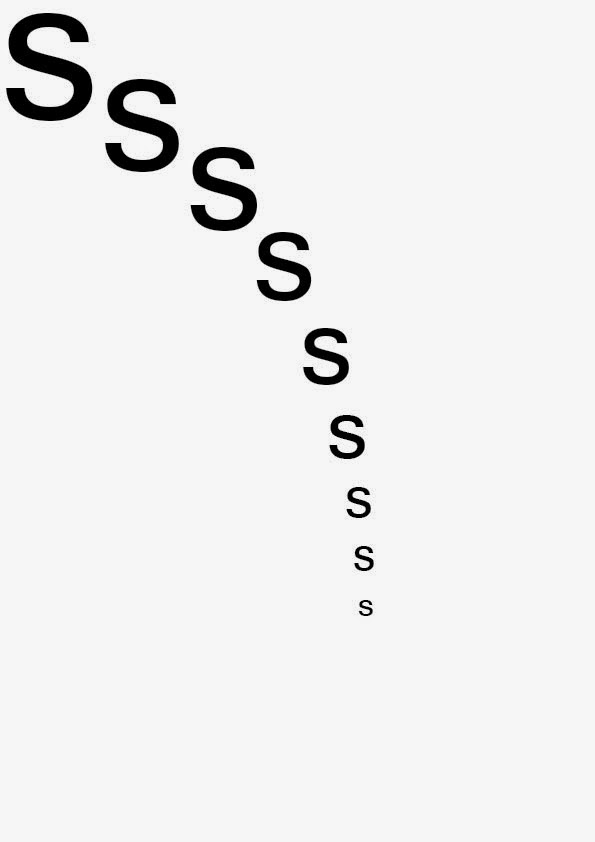
I then tried to portray emotions through using one letter and typeface; in this case I used the letter S to represent myself and the typeface Sans Serif. I played around with the letter making sure that I used the space of an A4 sheet each time. This was more successful in capturing the viewer’s attention compared to my initial logos because it gave the view more to think about. 20 emotions were created in the end but I also wanted to bring the project a little bit further; thus I decided to present the emotions in a book.

In this book, I decided to refer to polaroids I have taken throughout the month of October. The polaroids have also been an influence after watching the film Memento, where the main character takes polaroids in order to remember events. Each chapter is a specific date which I have captured on my polaroid. The emotions were selected from the 20 and will show how I felt on the day, thus I am portraying a typographic journal in a narrative book.


content
disappointed

excited


confused


lost

sad


After receiving feedback on my first draft, I decided to make a 2nd edition for November. I made an extra three emotions and also included cover pages to give my book more context. The cover pages are photocopies of my polaroids so it should make it clearer to the reader of what my book is about.
Overall, I enjoyed my final piece and I feel that the ideas have come together in the end. If I were improve anything it would be to experiment with different printing techniques to improve the aesthetics and content of the book.


You may also like

No comments: